
Client:
Lumen Technologies
Senior Designer
CenturyLink’s enterprise sector was officially separated from the old brand, with a new identity and as the flagship brand: Lumen Technologies in Sept. 2020.
As a senior designer at Lumen’s in-house design team, I took on most of the digital branding elements that needed to be establish by in-house team. Projects including social icons & cover images, favicon, tagline lockups, chat widget interface, defining App Store icon styles, Lumen Podcast Network’s icon styles… prior, during and after the site launch in Sept. 2020. Now as a member of the web task forces team, we’re continue working on modifying, improving the now 1+ year old lumen.com…
Here are just a couple of projects I worked on, except web pages, my interactive and animation pieces.
Branding Ideation
When the new branding review first took place in May 2020, the design team was asked to give feedback. I brought up a couple suggestions.
On brand colors: I provided 2 suggestions:
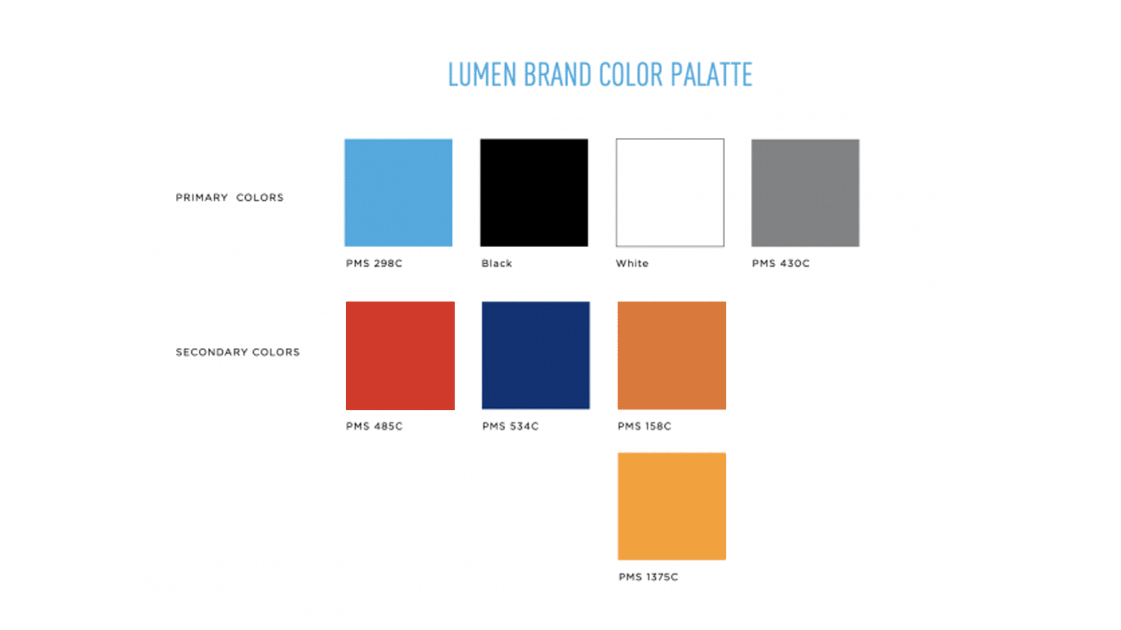
1. Slightly tweak the red & orange tones, update the almost brown dark gray to a cooler blue gray, to avoid the retro look. This suggestion has been ignored at that time. But now the team decided to modify brand colors, after exploring a bold, more colorful look and realized the retro tendency.
2. The agency provided 3 neutral colors: black, white and a system grey as part of Lumen’s brand color palette. I have worked on many rebranding projects, large and small, in-house and at various agencies. I understand the importance of neutral colors, and the options seamed to lack a sense of sophistication. Additionally, they didn’t add much depth to the primary bright colors. The Creative Director accepted my suggestion and changed all of Lumen’s original grey tunes to a series of much more sophisticated colors, instead of just functional grey like #eee, or #333… Here is the first draft and final version.
On the e-commerce platform: half year prior to Lumen’s launch, I brought up the importance of building an e-commerce platform for B2B. The idea seamed too advanced at the time. Just recently the company decided to switch to Magento. I guess my e-commerce and Re-branding experience worked out for us. I was very aware of the backend involved for an e-commerce solution, and the site redesign cycle means…
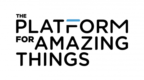
Tagline Lockup
I created this special font with rounded corners and cut outs to mimic Lumen logo’s treatment.
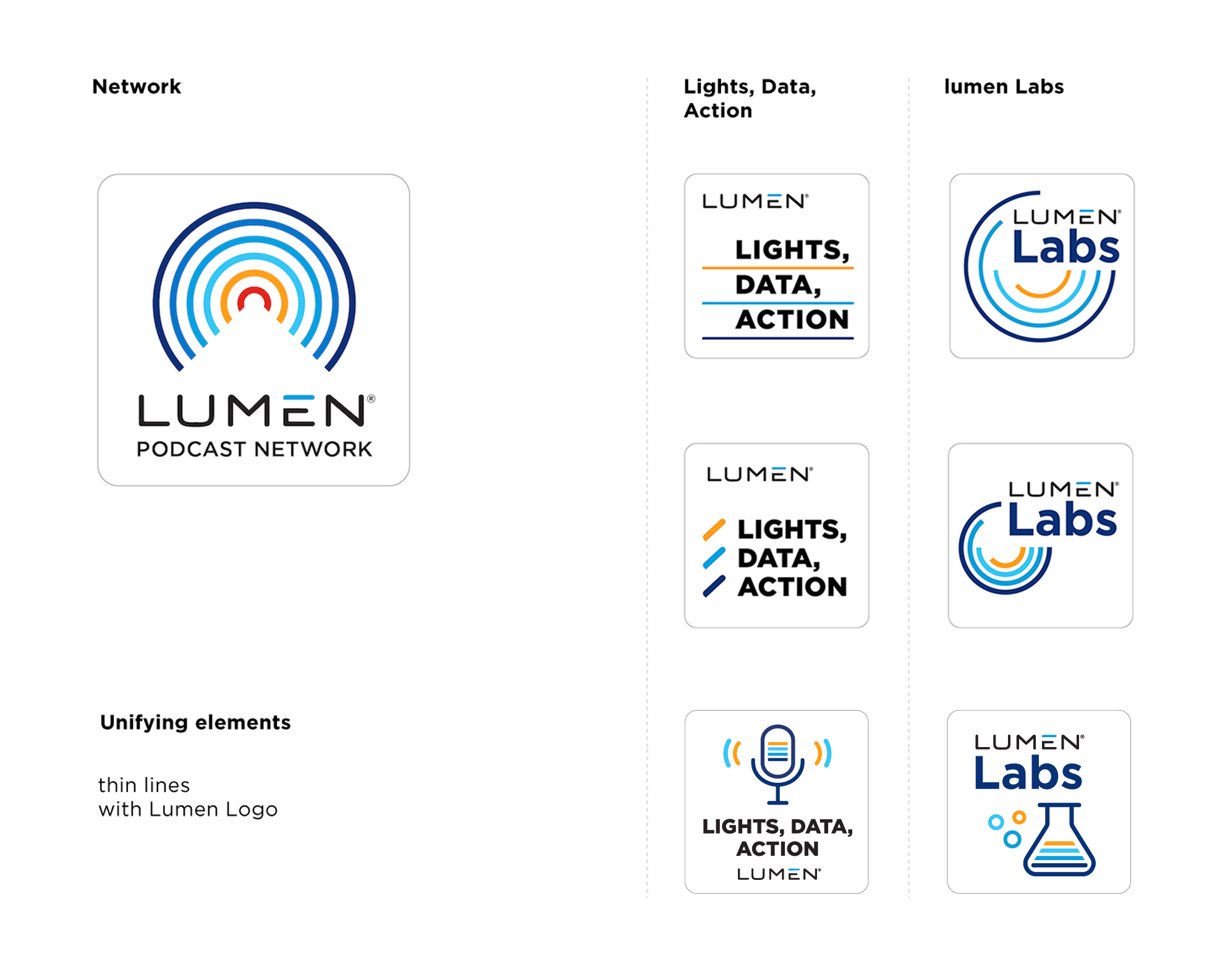
Lumen’s Podcast Logo series.
Lumen decided to start a Podcast Network. I created this series to establish a visual language for all Lumen’s podcast channels to come. It’s a fun project, and it inspired our team to approach a more colorful representation of Lumen’s brand, which led to our color palette modification…
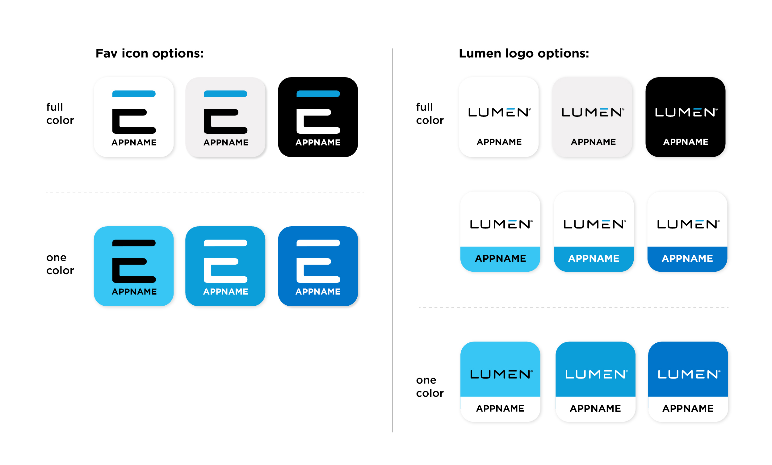
Lumen’s App Store Icon System
In the effort to update existing apps to reflect our new Lumen brand, I created a variety of App Store icon samples as a set of rules for all lumen apps moving forward.
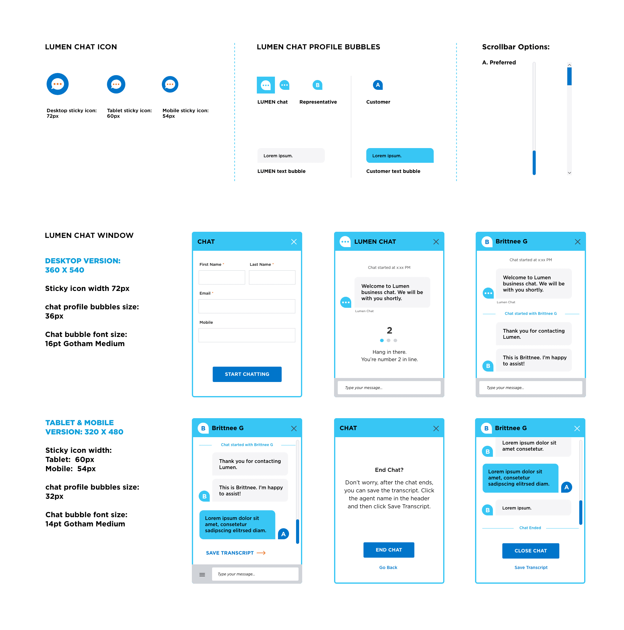
Lumen Chat
Right before Lumen’s launch, I was assigned to create a style for Lumen’s chat widget. Getting to know what the backend limitations for chat support were was interesting.
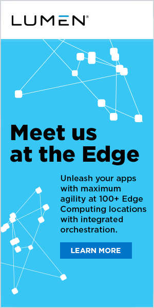
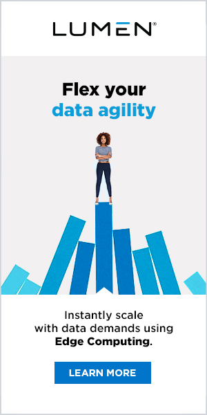
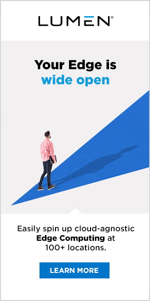
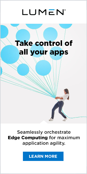
Hundreds of animated banner ads for all major campaigns.
I haven’t touched Adobe Animate (used to be Flash) for many, many years. But after the 2 years stay at Lumen, I got them all back. I’m the super animator again! : )


CSS/SVG animation playground.
Our dotcom is build on the AEM system. Designers don’t normally get the chance to work with dev team closely on interactive projects like most of the in-house design team/agencies do, which created a lot of limitations. Most of our interactive projects have been outsourced to outside venders. :/ We used ION and other animation tools to accommodate limitations, but as an interactive designer, that’s a big drawback. So I started learning CSS & SVG animation on my own this year. I will keep going, until js is not a roadblock to me anymore.